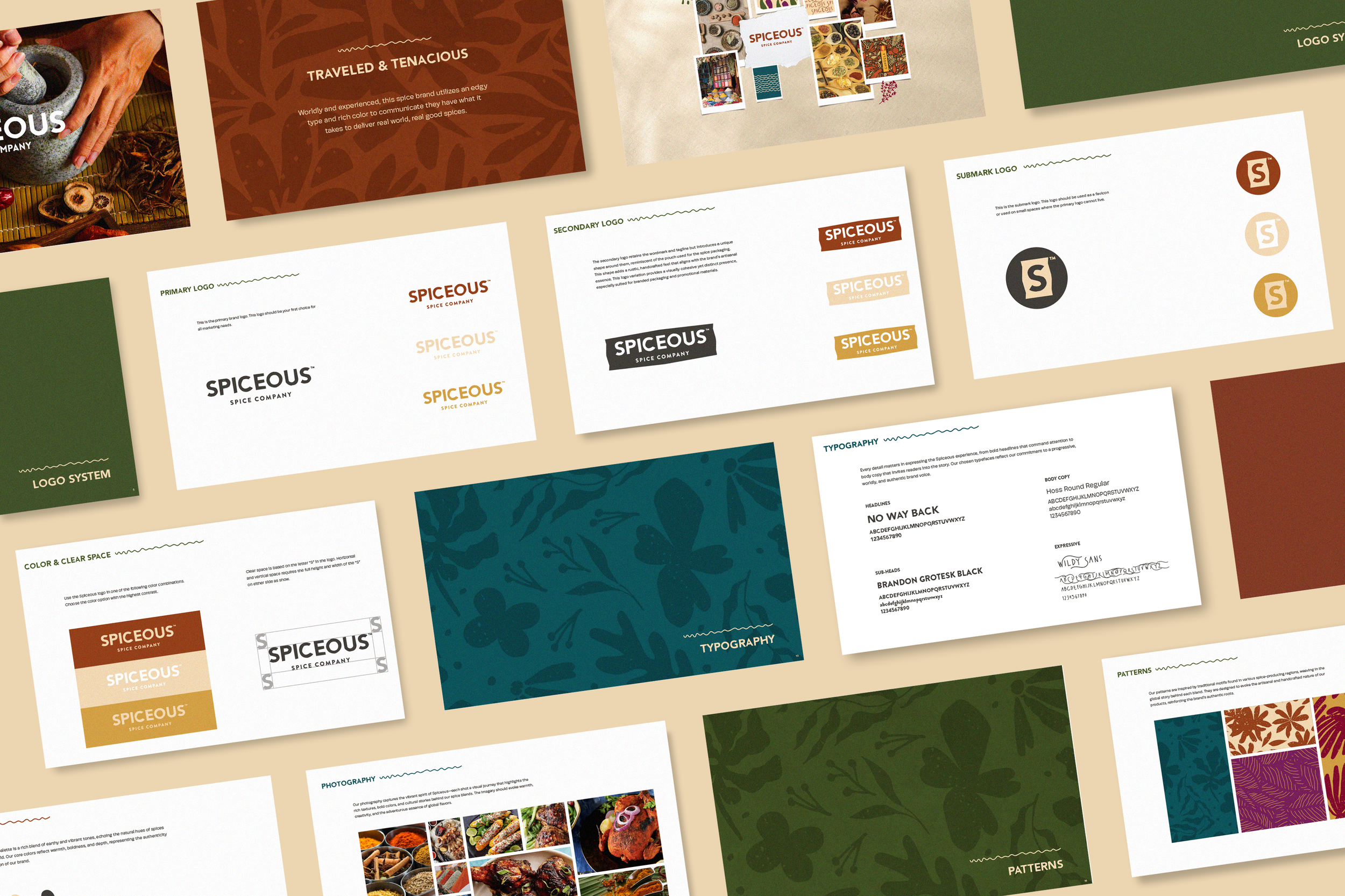
Spiceous was created for a startup looking to bring a more elevated, design-driven presence to the spice category. Most brands in this space feel crowded, overly decorative, or stuck in a traditional visual language. This identity intentionally moves in the opposite direction.
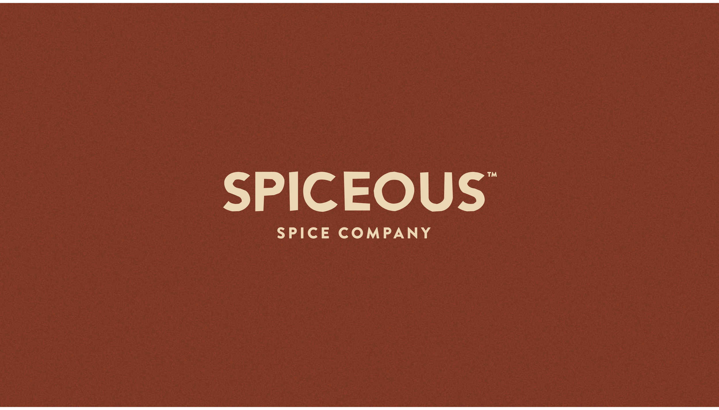
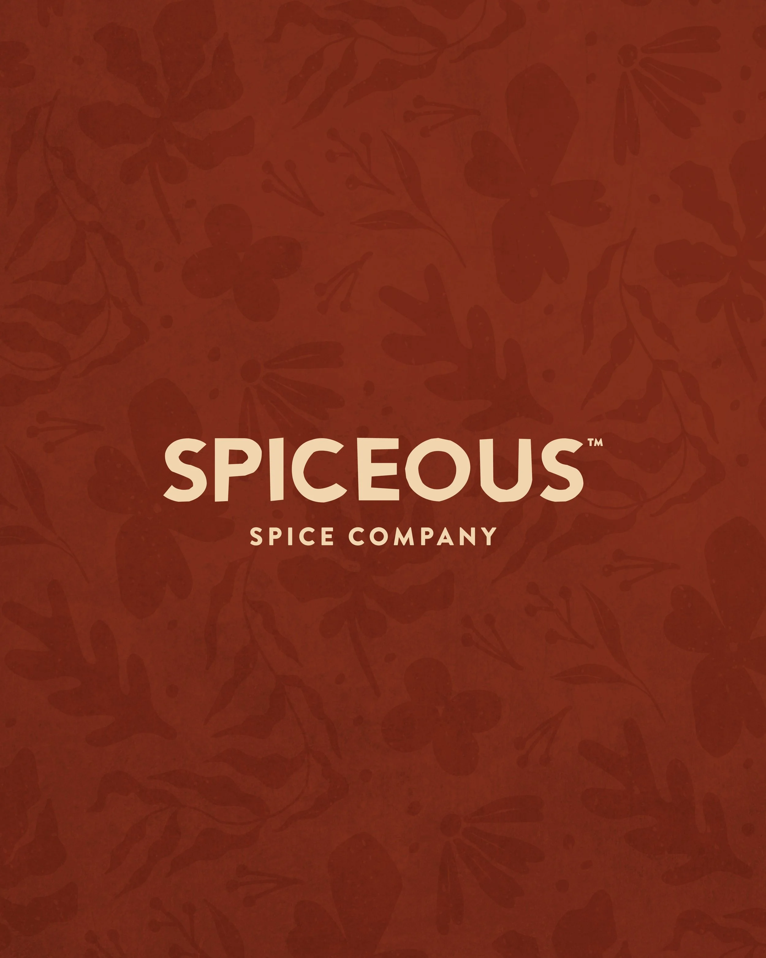
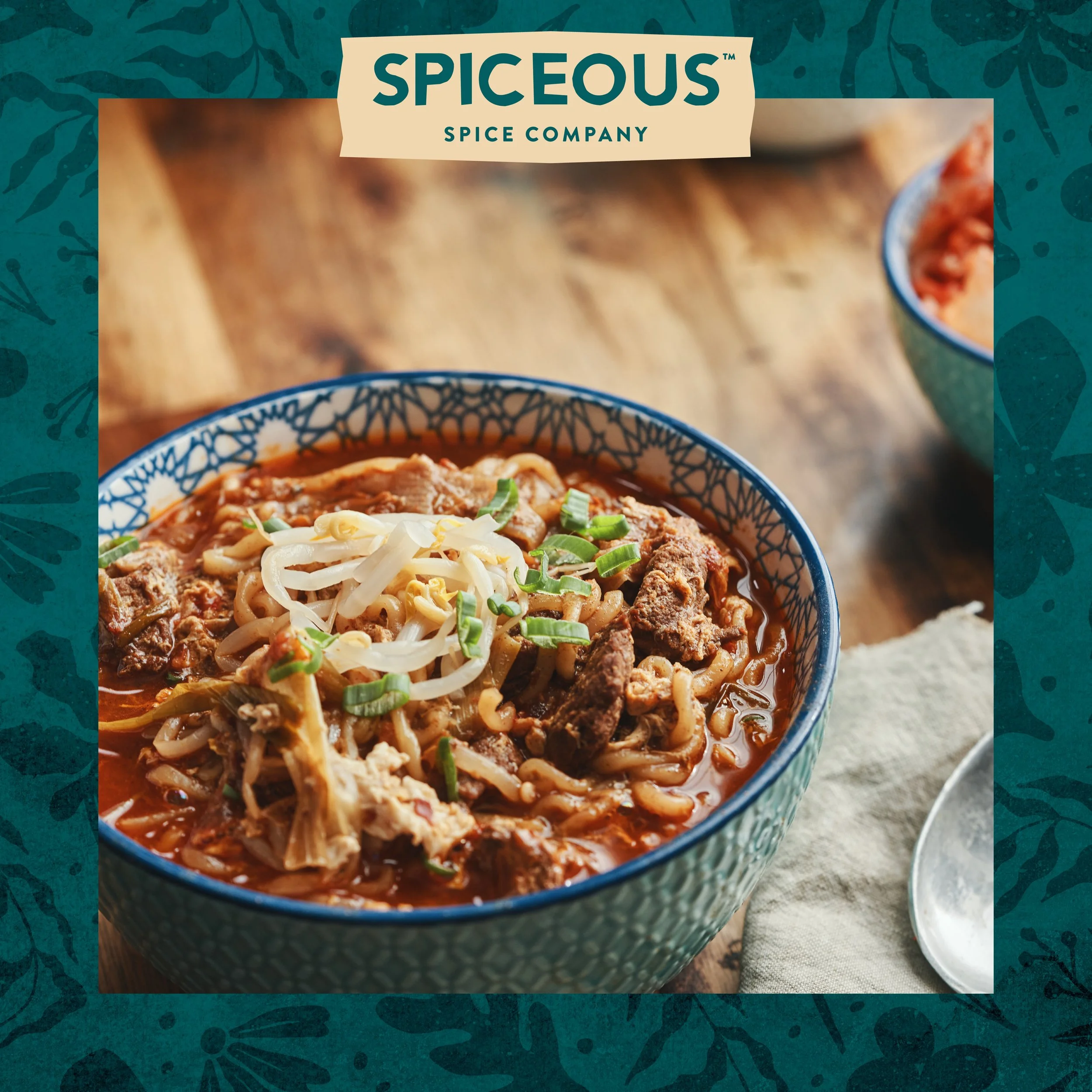
The logo is built around a bold, stripped-back wordmark. I focused on strong, balanced typography with subtle softness in the curves to keep it from feeling too rigid. There’s no reliance on icons or embellishment, the type carries the brand entirely, which makes it feel more confident and modern.
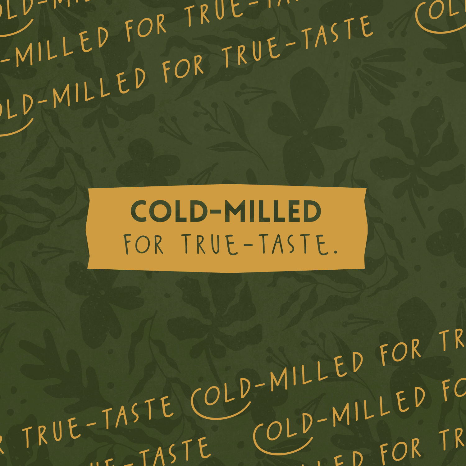
The warm, earthy color direction is a direct nod to the richness of spices, but simplified into a single dominant tone. This keeps the identity focused and recognizable, while still feeling grounded in the category.
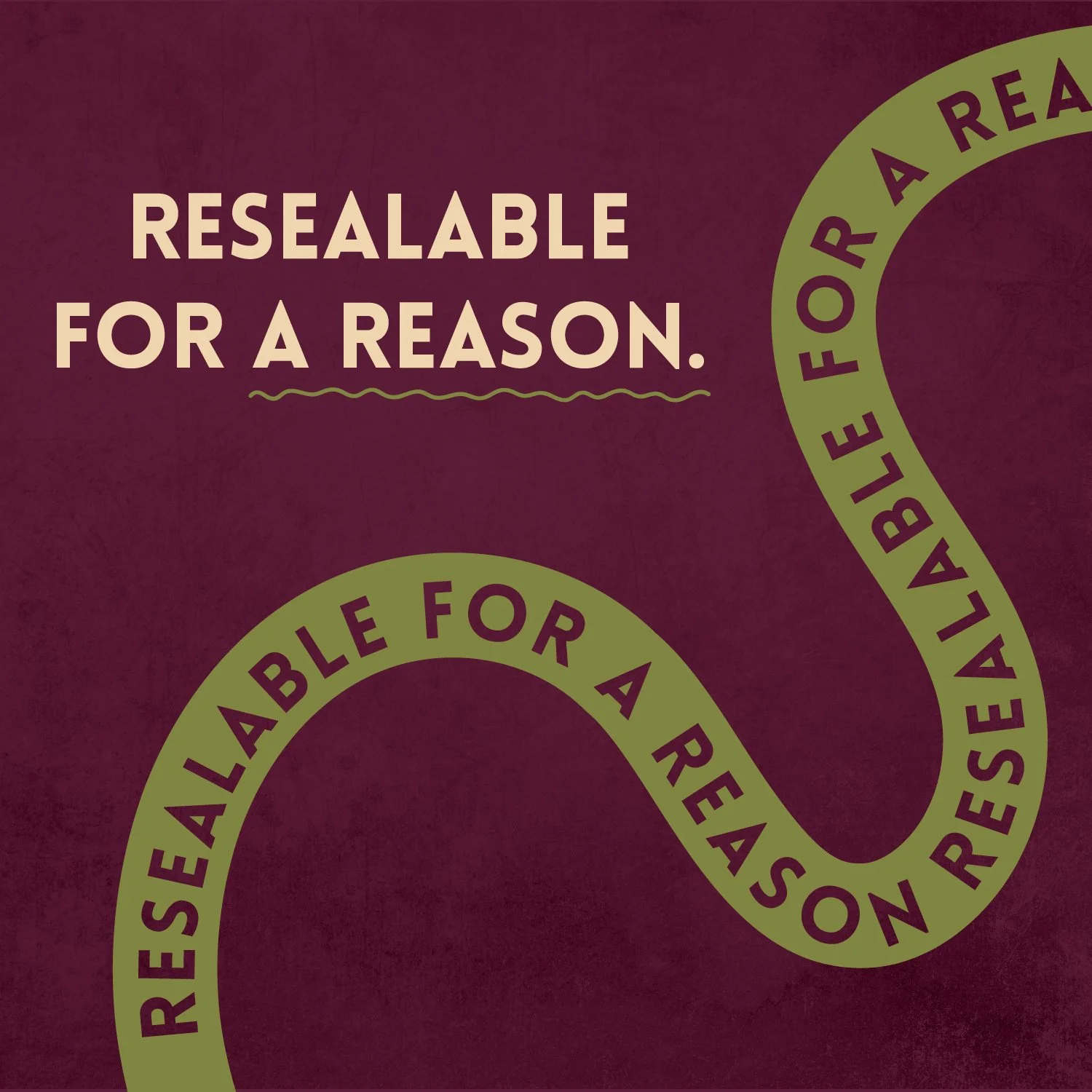
Even the supporting “Spice Company” lockup is understated it adds clarity without competing for attention. Every element is intentional and reduced to what’s necessary.
The result is a brand that stands out by doing less clean, bold, and designed to feel at home in a more elevated, contemporary space.
Brand Development
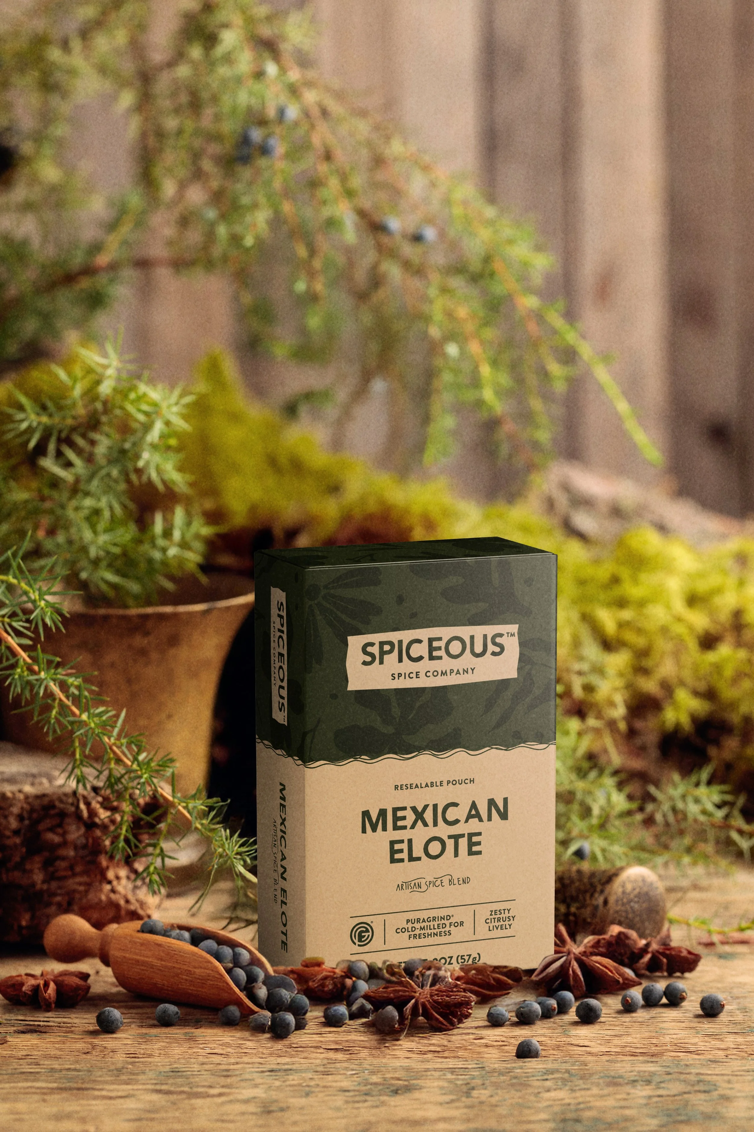
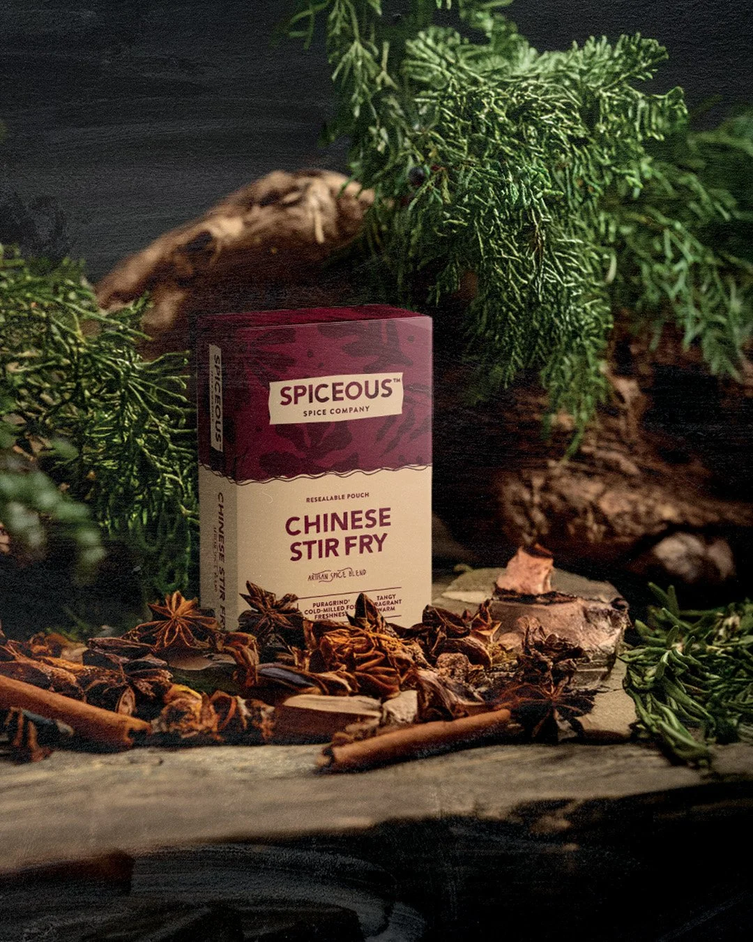
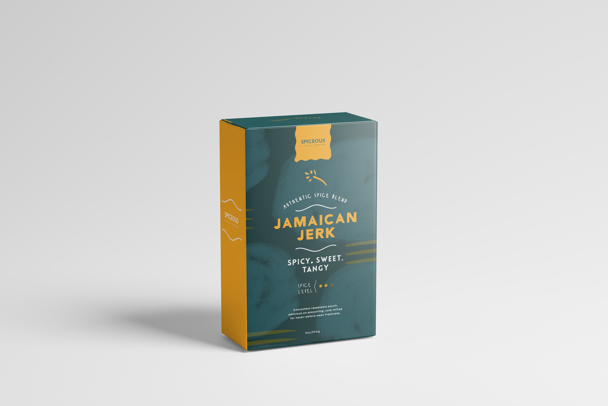
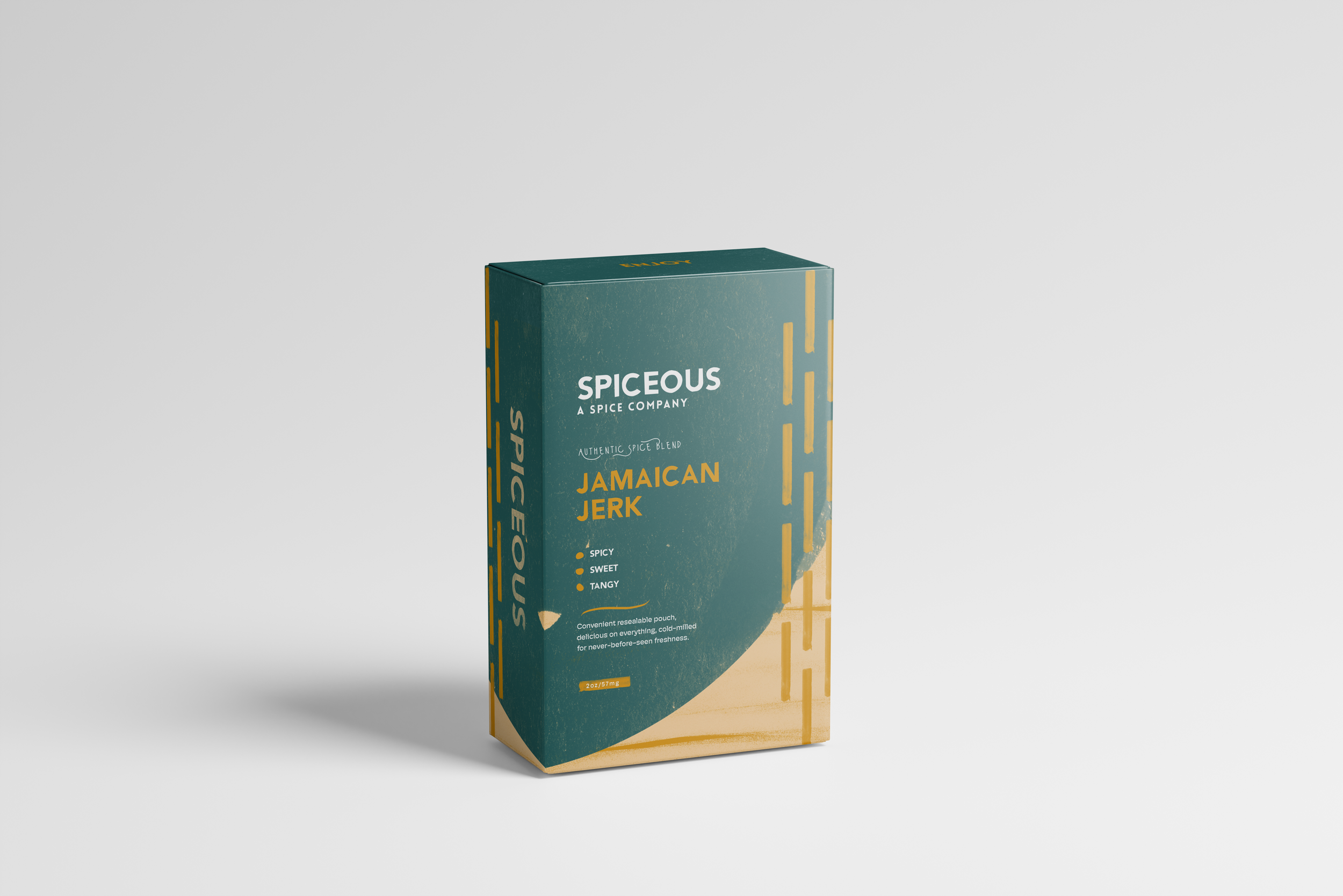
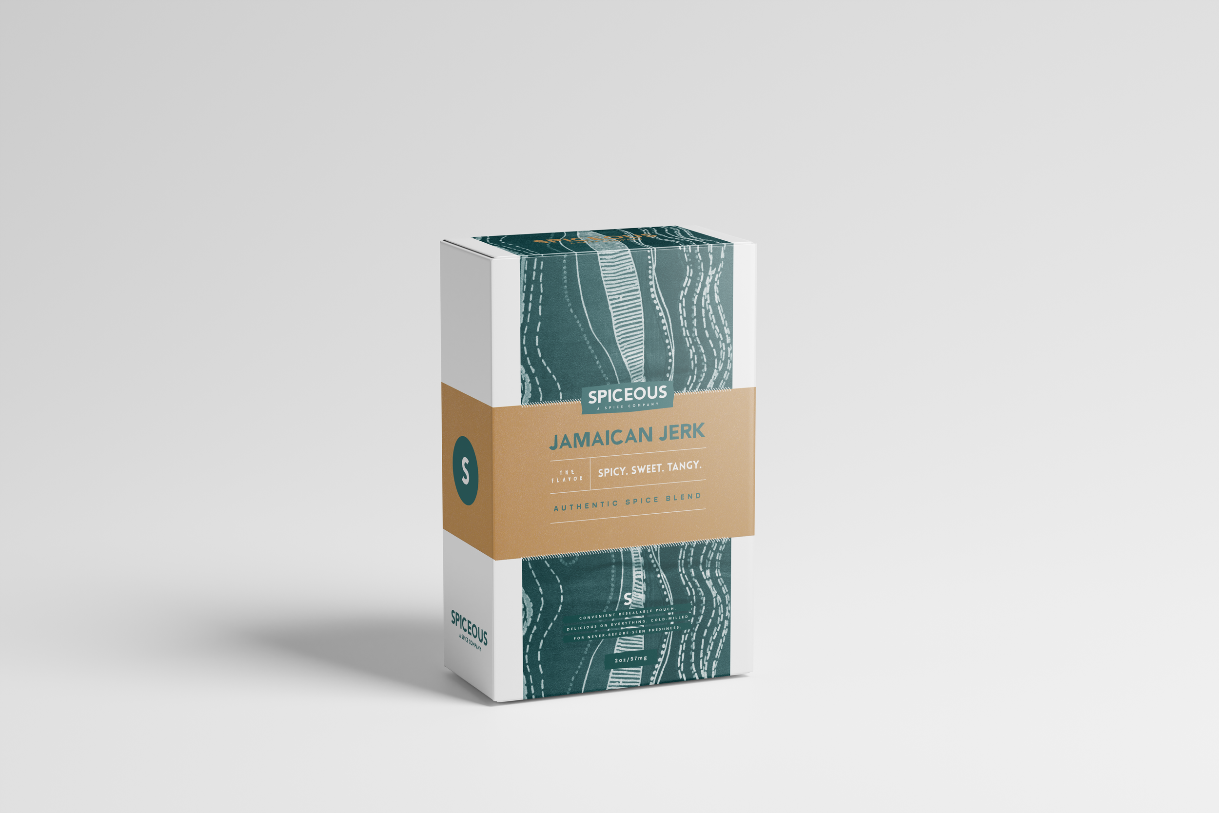
packaging exercise
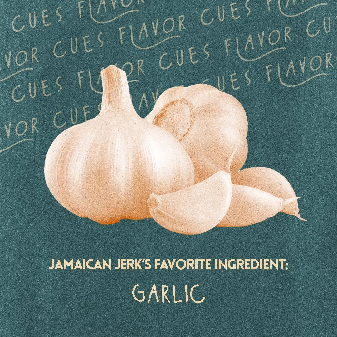
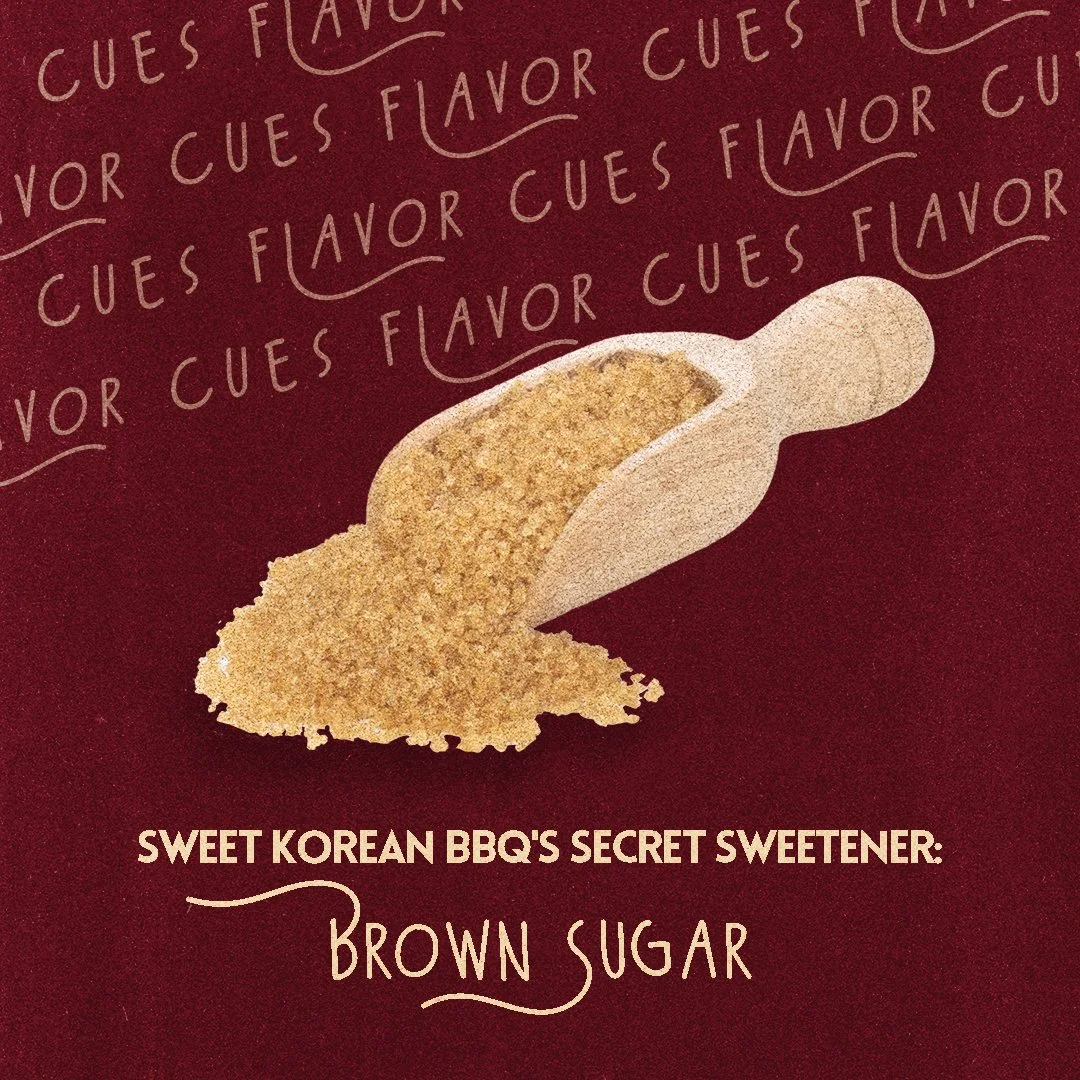
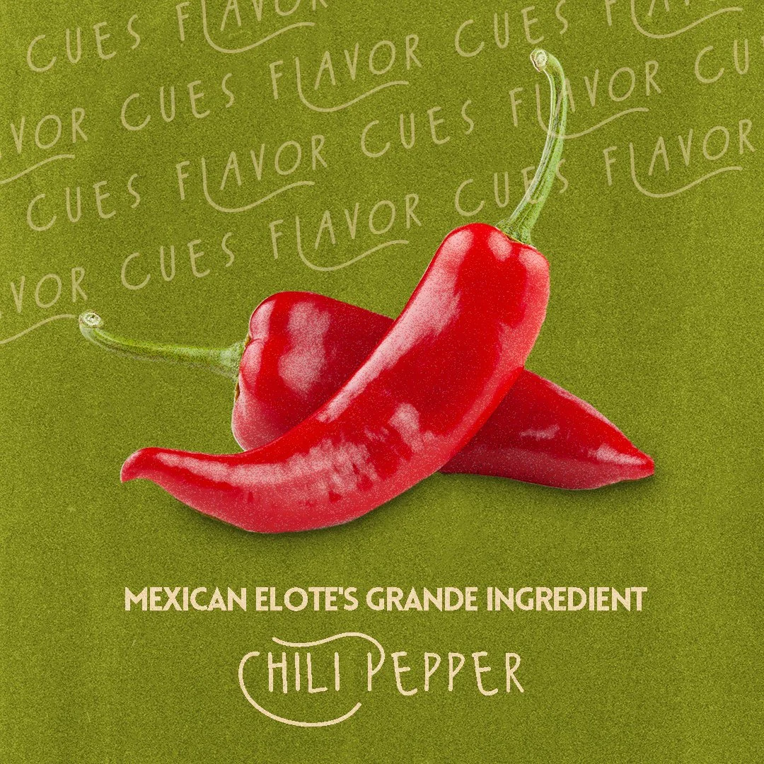
Social ideation

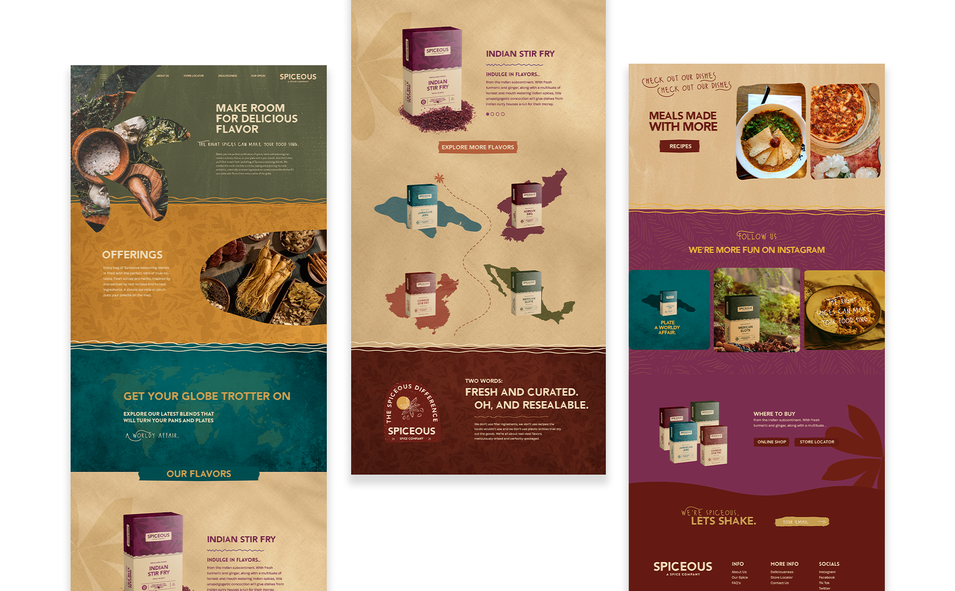
Website design
